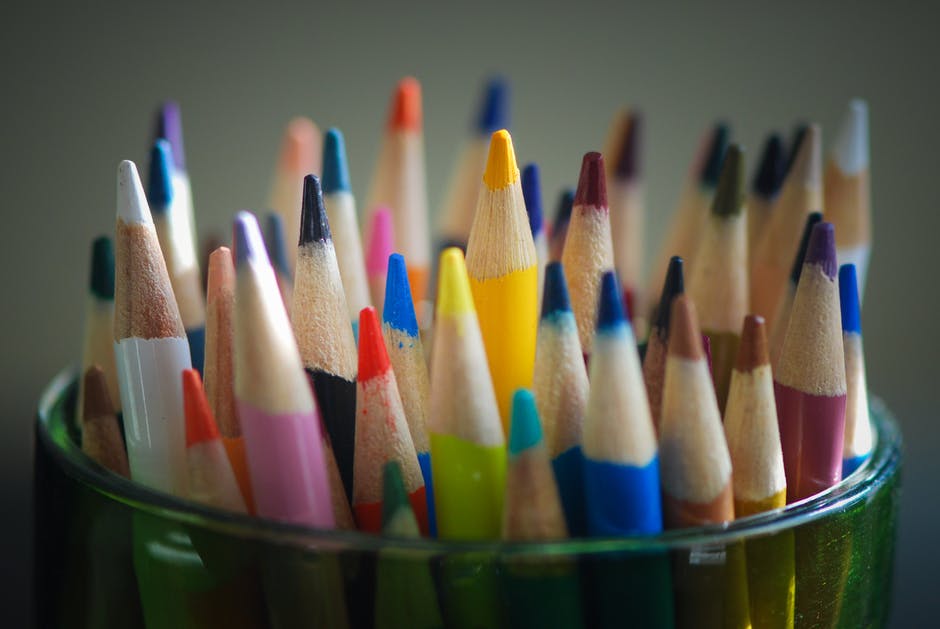
In our modern world, a good website design is one that inspires emotions and allows the visitor to experience a wonderful journey while browsing. For this, colors, shapes, page structure, and even images have a paramount level of importance. However, our personal experience as one of the best Milwaukee Web Design Agencies showed us that among all these factors, the color combination is extremely important.
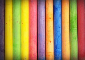
If the tones are not right, your site may not have the possibility to send the right message to the right people. After all, many scientific studies proved that colors touch our basic inner emotions, causing effects on our mood and behavior. Even more, according to Neil Patel, 85% of the reason a person decides to purchase a product is in color.In conclusion, there is a powerful level of connection between colors and conversions.
Color Psychology in Web Design
Color Psychology is the science that studies how colors affect human behavior. When it comes to web design, its theories and principles teach us that a site’s success in terms of conversion rates depends on how we use color. Of course, this is not valid just for web design – anyone working with people will have to consider learning about colors. But how exactly do you apply color psychology on a website template?
Our years of experience working on many and varied web design projects in the Milwaukee area thought us that there are several factors to consider such as:
- Where to use the colors
- How to choose the best colors for your business
- How to connect colors with your audience
Let’s take them step-by-step and see how these factors will impact web design.
Where to use colors
When it comes to a template, there are a few areas common to any design that must be highlighted through color. These are:
- Borders
- Pop-up windows
- Headline areas
- Background
- Banners or hero graphics
- Buttons – especially if you have call for action elements
Now, the colors you choose for these areas is usually influenced by the type of audience the site is going to have.
How to choose the best colors for your business?
Colors generate emotions and you need to understand the type of emotions you want your visitors to have when browsing your site. For this, we took two examples of two different companies, with completely different audiences and compared them.
- The first company is L’Oreal – the well-known beauty brand that addresses women from everywhere. They tend to use luxurious color combinations like pink shades on a purple background trying to create a special, sophisticated image that is easy to understand and apply.
- The second company sells bouncy jump houses and has a completely different audience. Thus, they use mostly shades of green, red, and yellow to create a fun and inviting page.
How to connect colors with your audience?
The trick here is to know what your audience likes in terms of color. For instance, it was proven that women don’t like colors like brown, gray, or orange while men dislike brown, purple, and orange the most.
In any situation, you have to know where to use colors and how to use them and everything is reduced to understanding your audience.